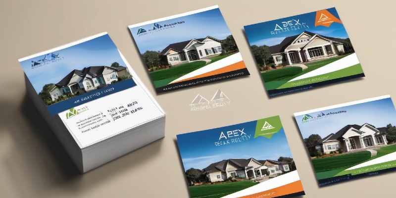
How to Design Real Estate Postcards That Actually Work
 A well-designed postcard creates a connection before the first conversation begins.
If you’re still treating real estate postcards as old-school “print and pray” marketing, it’s time to reboot your strategy. Postcards still work — in fact, they often outperform digital ads for lead generation and brand recall — when they’re designed strategically.
Let’s break down exactly how to design real estate postcards that actually get results, drive response, and make your phone ring.
1. Start With a Clear Objective
Every great postcard starts with a single purpose — not five. Are you promoting a new listing? Farming a neighborhood? Following up with open-house visitors? Each goal demands a different message, call-to-action, and layout.
A “Just Listed” postcard should focus on the property’s wow factor and neighborhood buzz. A “Just Sold” postcard should highlight success and urgency. A farming postcard should build familiarity and trust over time. Decide the goal first, and your design decisions will flow naturally from it.
2. Focus on One Powerful Image
Your main image is your headline. Choose one strong photo that instantly communicates value — a stunning exterior shot, a modern kitchen, or even a smiling agent photo if the message is personal branding.
Avoid collages that fight for attention. One hero image plus white space will pull the eye in faster and create a cleaner, more professional impression.
3. Write a Headline That Grabs, Not Gabs
Your headline is the first line of copy they’ll actually read — make it bold, emotional, and benefit-driven. Use verbs, numbers, or emotion to grab attention, and skip generic “Contact Us Today” phrasing.
4. Keep the Copy Short — But Strong
Postcards aren’t brochures. You don’t have room to explain your entire marketing plan. Aim for 50 to 75 words of copy — just enough to create interest, not overload.
Headline → Supporting Benefit → Call to Action. That’s the structure of high-performing postcard copy.
5. Use Color to Guide the Eye
A smart color palette controls what people notice first. Stick to your brand colors, but use contrast to direct attention. Bright accents like your brand orange (#E67E22) make CTAs pop. Softer neutrals create calm and balance.
6. Make Your Call-to-Action Impossible to Miss
Your postcard should make the next step obvious: call, text, scan, or visit. Feature your CTA prominently — ideally twice (once on each side). Direct, specific, and easy to act on — that’s how real estate postcards convert.
7. Add a Personal Touch
People respond to people. Include your name, photo, and contact details in a friendly, conversational style. A short note like, “Hi, I’m Lanard Perry… let’s chat,” humanizes your marketing and builds trust.
8. Use Both Sides Wisely
Think of your postcard as a two-sided story. The front captures attention; the back closes the deal. Add a QR code to bridge your offline postcard to your online funnel.
9. Size, Quality, and Mailing Matter
Quality always matters. Use sturdy cardstock, semi-gloss finish, and clean mailing lists. 4x6” and 5x7” cards are cost-effective; 6x9” cards create luxury appeal for high-end listings.
10. Test, Track, and Repeat
No postcard campaign should end at the mailbox. Track results with QR scans or call tracking. Test new headlines or offers in small batches before scaling. Agents who win don’t send more cards — they send smarter ones.
Bonus Resource
Want done-for-you templates and design inspiration? Download the free guide: Eight Real Estate Flyer Ideas That Trigger Action — your next postcard design could start right there.
More Real Estate Postcard Marketing Tips for New Agents
See all Real Estate Postcard Marketing Articles Here!
Home > Real Estate Postcards >> How to Design Real Estate Postcards That Actually Work


